GoSwag

Date
June 2026
Role
Product Designer & Developer
Company
GoSwag
Product Research · UX Strategy · Visual Direction · Front-End Development
Key Outcome
How a working Next.js site replaced a cover letter
GoSwag is a Glasgow-born, Series A corporate gifting platform used by Spotify, Meta, Amazon, ElevenLabs, and 1,000+ global organisations. Their job spec said the first major project was a ground-up website rebuild of a site that signals tech-led disruptor
Background
When I came across their Product Designer job listing, the spec said the first major project would be a ground-up website rebuild of a site that "signals tech-led disruptor."
Rather than write a cover letter describing what I would do, I used that brief as the actual brief and shipped a working first iteration before applying.
I spent time researching GoSwag from the outside in before writing a single line of copy or code: fetching their live site, reading the seed round announcement, pulling real Trustpilot reviews verbatim, and finding where Sonny™ was named explicitly in a Vestbee funding article. That research surfaced a founder quote that became the philosophical anchor for every decision in this project:
"The catalogue is dead and we're replacing it with smart AI-assisted curation and a better gifting process to match." Conor McKenna, CEO, GoSwag
The Problem
GoSwag's current site has a credibility gap.
The product is genuinely tech-forward with an AI recommendation engine (Sonny™), automated recipient collection (Claim Pages™), and global fulfillment infrastructure, but the website reads like a premium logistics brand, not a tech platform.

The core diagnosis:
Their current site sells a service. It needed to sell a system.
Five specific problems identified during research:
Problem(s) | Explanation |
|---|---|
The headline describes nothing | "Effortless. Borderless. Trusted by global giants." — three adjectives with no subject. It could belong to a courier company, a freight platform, or a cleaning service. No emotional hook. No differentiation. No reason to stay. |
Sonny™ is invisible. | Their biggest product differentiator is an AI engine that analyses your brand URL and generates a bespoke swag proposal, which was mentioned once, below the fold, in a single sentence. No visual. No demo. No proof it exists or works. |
Proof points are buried. | 1,000+ organisations, 112% CAGR, 96% admin reduction are Series A-level numbers that establish immediate credibility. None of them appear above the fold on the current homepage. |
Catalogue structure, not a conversion narrative. | The page flows: Hero → Services → Contact → More services. There is no story. No sequence that moves a visitor toward a decision. It shows products and hopes someone buys. |
Visual language signals the wrong category. | Light, photo-led, warm — it looks like a premium gifting service. Not a tech platform. Not a disruptor. |
The Solution
A service site shows you what they offer and asks you to get in touch. A system site shows you how it works, proves it works, and makes the next step feel inevitable. Every design decision below is a direct response to one of the five problems identified above.
The entire solution flows from one central reframe:
Service → System
Headline — fixing problem 1
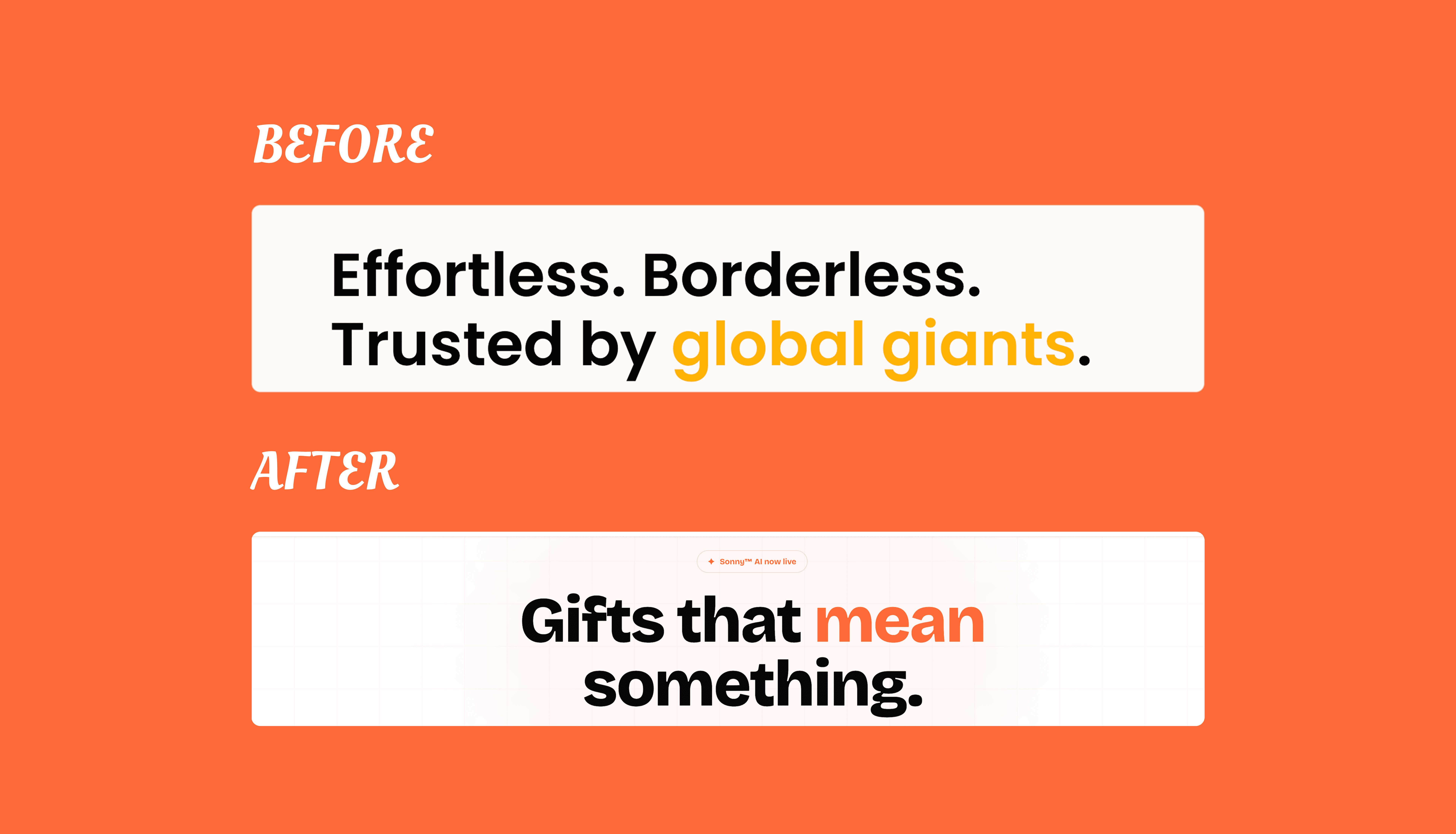
Three adjectives became one sentence. "Mean" does double duty: meaningful gifts, and we mean it. A complete thought with emotional weight. No other gifting platform can own this line.
The headline is set at text-8xl (≈128px) to establish a 2.5× visual ratio over the supporting stats. The hierarchy is unambiguous; the headline is the statement, and the numbers are the proof.
Sonny™ AI in the hero — fixing problem 2
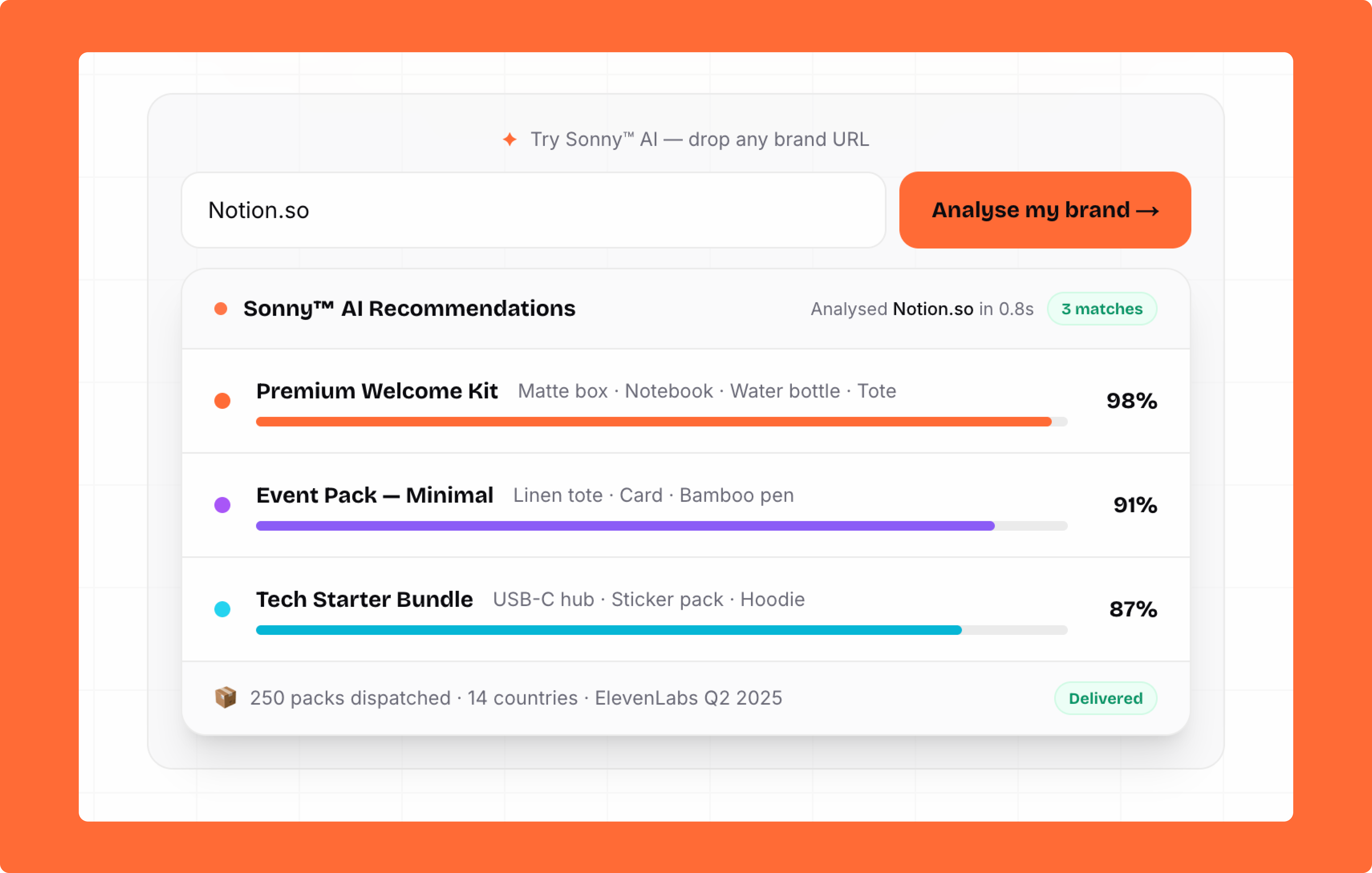
Rather than a static screenshot, the hero features a live URL input. A user types any brand domain, Sonny™ "analyses" it, and returns simulated swag recommendations with animated match score bars. You see the product's thinking before anyone explains it.
The interaction is the proof of concept. Show, don't tell.
Proof points above the fold — fixing problem 3
all pulled directly from GoSwag's own seed round announcement placed in a stats row directly beneath the hero CTAs. Hard numbers that answer, "Why should I trust this before the visitor even scrolls.
Conversion narrative — fixing problem 4

Every section earns the next one. The page closes with "Generate my swag proposal →," not "connect with our experts." Specific to Sonny™. It feels instant. Reinforces the AI-first promise at the exact moment of conversion.
Visual language — fixing problem 5
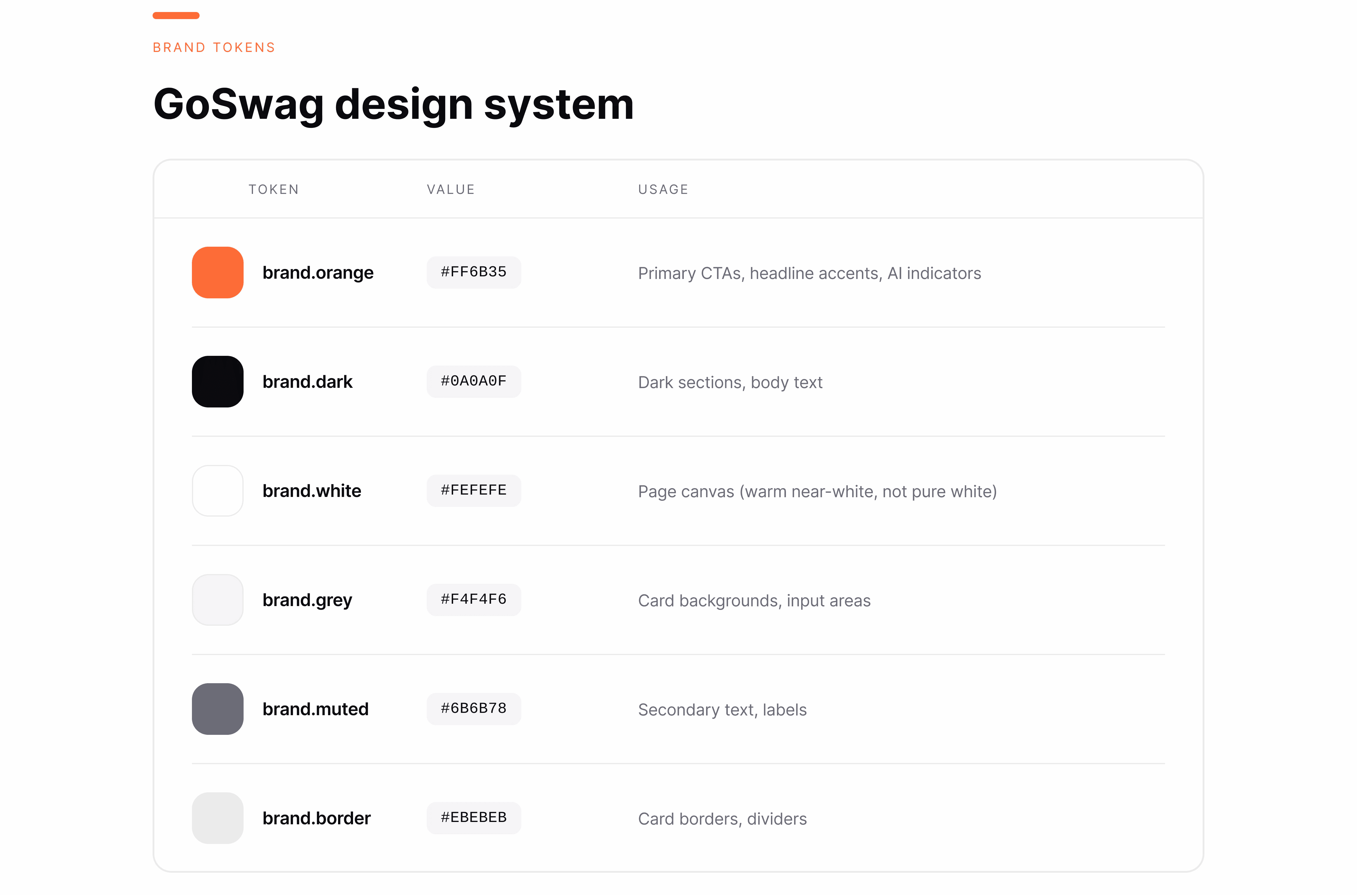
Canvas: #FEFEFE ; warm enough to feel premium, clean enough to signal software. Pure white reads clinical.
Dark sections: Two full-width contrast sections in #0A0A0F with a film-grain texture overlay via SVG feTurbulence. Signals precision and confidence the way Stripe and Vercel use dark sections to anchor key moments.
Typeface: Bricolage Grotesque (weight 800) for display — expressive, editorial, design-forward. Their current rounded sans reads service brand. Bricolage reads tech company.
Orange with restraint: Reserved for primary CTAs, hero badges, headline accents, and AI indicator dots only. When it appears, it lands with intent.
Additional decisions
Bento grid for features
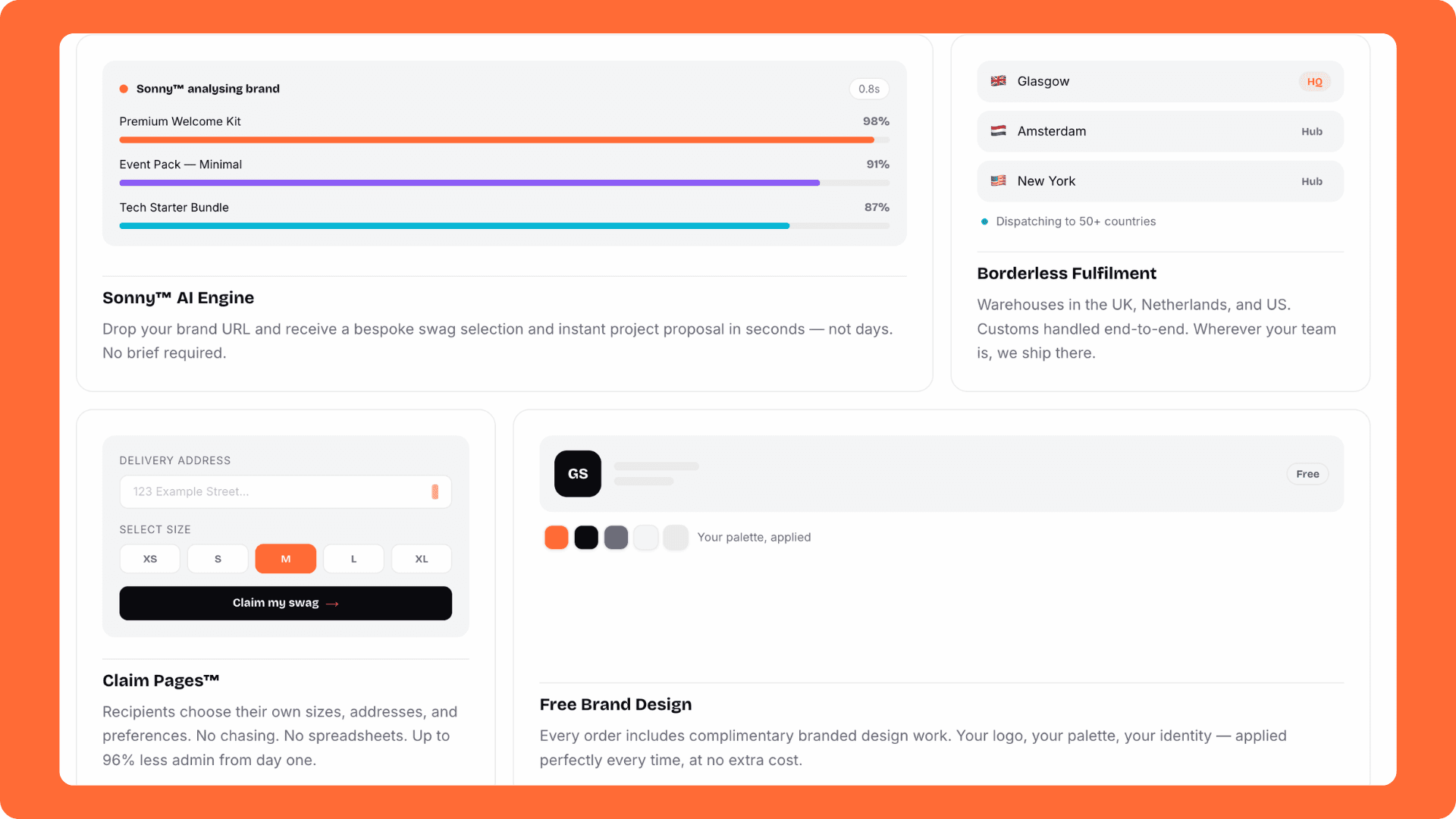
Each feature card contains an inline HTML mockup of the actual feature, not an icon and a label. Users understand what they are buying through demonstration, not description.
Testimonials without star ratings
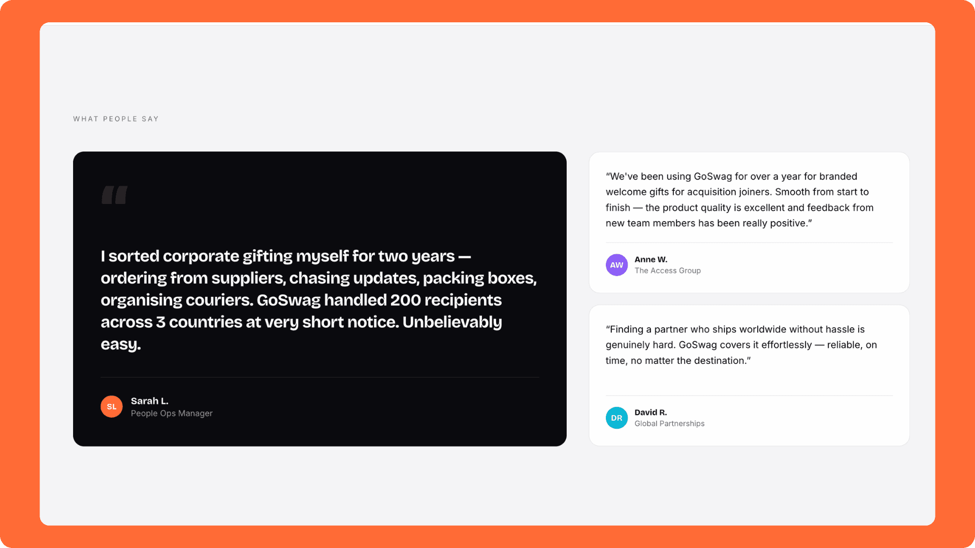
Star ratings are a B2C pattern. A B2B tech platform with Spotify and Meta as clients is validated by the words of real admins, not five orange stars. All quotes are verbatim from Trustpilot.
Iteration 2 — what changed after the first build
After the first build I ran a structured audit and shipped a second iteration:
Hero hierarchy scaled headline and reduced stats, establishing the 2.5× dominance ratio
Product tier cards added "Best for" audience labels, feature checklists, and a "Most popular" signal so each card answers, "Is this for me?"
Logo strip upgraded from text-only to real SVG brand marks
Mobile audit at 375px fixed three specific failure modes: hero stats stacking, Sonny™ form button overflow, testimonials quote mark overflow
Outcomes & Impact
A working, deployed, fully responsive homepage built in 2 days with no brief, no design system, and no one to ask for feedback.
The Talent Lead at GoSwag responded:
"Thank you for sharing your work, we love seeing our brand brought to life like this."
The role ultimately could not be offered remotely, so the engagement ended there. But the project stands as a complete piece of work and a clear demonstration of what I bring to a product team from day one: research rigor, design rationale, and the ability to ship without being managed.
What this project proved:
A design brief can be answered with a deployed product, not a PDF
Real research (Trustpilot, funding announcements, live site audits) produces better copy than anything invented from scratch
AI-first workflows: Claude for research and copy, VSCode/CloudCode for development; compress a week of work into days without sacrificing quality
Reflections & What Comes Next
What I learned and where this goes
What I would do differently Starting with a mobile-first build rather than auditing at 375px after the fact would have caught the three layout failures earlier. The hero visual hierarchy issue, with the headline and stats too close in size, was also something that needed a fresh eye after stepping away. Both are process notes for the next project.
What iteration 3 looks like
Build GoStudio as a standalone route with its own visual language — luxury creative agency inside a tech company
A/B test the hero headline against a more direct value prop variant
Instrument with PostHog to track scroll depth, CTA click rates, drop-off
Full design system documentation — tokens, components, spacing, motion
Floating sticky CTA that appears after scrolling past the hero
Check Out the Live Product